Again going down the lines of abstract and experimental ideas, Richard Robinson creates striking visuals for each album using vibrant colour pallets and expressive compositions in order to reflect the music produced by the artist, he really hits the nail on the head and manages to create completely different concepts and ideas for each.
These albums are the most relevant due to the variation of techniques used to and the feel of the aesthetics created.
Album Artwork Loco
Thursday, 27 September 2012

The XX
The xx have always used interesting aesthetics in their designs and also quite abstract which reflects the music they produce, this is similar to the effect i would like to give, re creating the feel of music played on the night with experimental aesthetics, also Ross has decided he would like to set up an exhibition running along side the night in a separate room in the same club, which would give us a chance to create work according to the feel of the room.
We will try to create a symbol for the art work and repeat the symbol over each flyer using different techniques for each night.


We will try to create a symbol for the art work and repeat the symbol over each flyer using different techniques for each night.


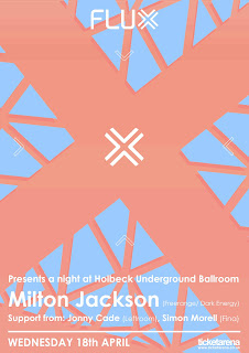
Flux
Starting my secondary with 'Flux' another house night in Leeds set up by a few other friends, this night has really taken off in Leeds and become very popular, the visuals for the flyers are spot on as well, the geometric aesthetic is something i would like to incorporate into my designs but with a more abstract twist in order to utilize my other skills, also the colour use within these designs is great.



Album Artwork.
Another area we focused on was Vinyl artwork, the aesthetics of the vinyl artwork we found seemed to be perfect for the direction we would like to take this project, a lot of abstract pieces and very experimental, our client also said that 'LOCO' would be expanding into much more areas than just a night, he would also like LOCO to become; A clothing range, a record label, an exhibition and possibly more, this is a good thing for me and my collaborative partner Yafet because this gives us the opportunity to create more deliverables.
Loco Vinyl
Loco Vinyl
Tuesday, 11 September 2012
Gent No. 5
Thinking of design direction and aesthetics and to give a high end feel, which i think is key within a barber shop identity, they have always had a traditional gentleman's feel, also with the name being Gents No. 5 i will try to create a traditional yet sleek execution.


Tuesday, 22 May 2012
Printed Business Cards.
Nearly there now, really hope my client actually takes this project and makes good use of it, that would make me over the moon, the business cards turned out okay, i should have used a thicker stock but that doesn't matter the quality still turned out alright and the i'm fairly happy with the imagery i used, just need to get everything together now to photograph and put my final boards together.


Saturday, 12 May 2012
Heydays.
'A full range architecture company that work on both public as well as
private housing, founded in Ålesund 1966. The identity, based on the
hyphen, communicates a bold and strong architectural language and
visualizes the energy that represents Kibsgaard-Petersen, through young
innovation combined with years of experience. Their solid red color
combined with stamping and embossing tools tells a story of a modern
company with solid traditions.'
Beautiful work here by Heydays studio located in Norway, easily in my top 3 favourite studios, this is a campaign created for an architecture company, really innovative work and very simple, creating a really strong impact for the client, something i would like to develop for my client's company.


Beautiful work here by Heydays studio located in Norway, easily in my top 3 favourite studios, this is a campaign created for an architecture company, really innovative work and very simple, creating a really strong impact for the client, something i would like to develop for my client's company.


Subscribe to:
Posts (Atom)