Quite a disturbing and dark video i have found, but an interesting concept in my eyes, the video explores how sound can affect objects within animation but also a human beings mental state, i think what i find more interesting is i believe one day sound could be used a weapon i.e. in the future we will find ways to manipulate sound to distort senses in a serious way or maybe even use it to our advantage, after all, all sound is just air waves.
Tuesday, 27 December 2011
Kyndill.
The use of colour, pace and simple shapes through this animation grabbed my attention from the very beginning. The beautiful flow of all the objects through time and the graceful way each part reacts accordingly with other has really inspired me to take much more care with pace and interaction in my animations.
Statkraft.
A simply information driven animation using all the techniques we have been looking at with after effects, perspective, 3D imaging and moving around the animation fluently.
Infographics.
Some more interesting info graphics animations using the same kind of style i want to incorporate with my work, and also very closely relating to the use of animation found on the discovery channel, the thing that is most appealing to me is the simplicity i don't to try and do anything to complex and intricate due to time my knowledge of this software.
Evolution.
This video i just found along with research so far to do with predators and pre-historic predators has just give me a really interesting idea, i think a top 10 best evolved species could be a really nice idea and offers a lot in terms of visuals, something i will definitely look into more.
Eco systems.
When looking at the top Apex predators i felt it was a good idea to split them into categories of eco systems. An ecosystem is a biological environment consisting of all the organisms living in a particular area, as well as all the nonliving (abiotic), physical components of the environment with which the organisms interact, such as air, soil, water and sunlight.
This allows me to find the top Apex predators of their own section therefore giving me a top Apex predators of the world.
Luckily for me, after doing some research i found the are 10 major Ecosystems these being:
- Mountains (High Elevation)
- Tundra
- Temperate Forest
- Marine/Island
- Desert
- Tropical Dry Forest
- Cold Climate Forest
- Grassland
- Savannah
- Tropical Rainforest
Apex Predators.
After doing a little bit of research i came across an 'Apex Predator'.
Apex Predators, also referred to as the alpha, super or top predator, are predators with no predators of their own, residing at the top of their food chain. Zoologists define predation as the killing and consumption of another organism (which generally excludes parasites and most bacteria).
Using this information i would like to explore the major eco systems on earth and hope to the top 1 / 2 Apex predators from these ecosystems to form my top 10 Apex predators of our planet.
I would also like to explore the Apex predators of the pre-historic world as i can image our predators would be nothing compared to them.
Friday, 23 December 2011
Immune System.
Not completely relevant but still animation, i just find it incredible how great technology is getting that we can now show what micro organisms look like and show how they work.
Discovery 3.
Some different ways to introducing programs for discovery, nice and clean type with little image to show whats happening, another approach i could take.
National Geographic.
Another Info graphic animation, this time on a more preferred subject, still a nice use of layout for the information and an interesting way to introduce a program something to bare in mind.
National Geographic.
National Geographic.
Tv Identity.
Looking at what Fred mentioned about channels having an identity their audience can relate to and how professional and informative discovery are, this short clip jumped right out to me, it has every aspect discovery use and the info graphics make it a really interesting video, i would like to use similar info graphics in one of my animations for top ten.
Senkyou.
A Music Video for 'mergrim' lovely flowing animation with interesting sharp movements something i'd like to use with 'snap' i particularly like how you see the full transformation of the shape the whole way through and how it explores all possible options of how to manipulate a simple shape such as a square.
senkyou - mergrim from makoto yabuki on Vimeo.
Skateboard.
Looking into different objects that are renowned for snapping i came round to watching this stupid kid breaking countless skateboards. It me quite a few interesting ideas for 'snap' the i'd like to try and incorporate the movement of a kick flip into one of my animations.
Telitriumph 2011.
A series of motion graphic i came across for what seems like an award show, each clip being introducing an award, i feel the simplicity of these and the concepts behind them are really engaging but i was a little disappointed with how disorderly it seemed.
TELETRIUMPH 2011 NEWS CATEGORY from Nazar Gnativ on Vimeo.
TELETRIUMPH 2011. ENTERTAINMENT CATEGORY from Nazar Gnativ on Vimeo.
TELETRIUMPH 2011. REGIONAL TV CATEGORY from Nazar Gnativ on Vimeo.
IDILL 2011.
This long animation has given me an interesting idea for 'bounce' to almost shred the letter forms and have each section bouncing into place.
IDILL 2011 _ Dance online short film festival animation from Bloc-D on Vimeo.
Thursday, 22 December 2011
Sky, 1. 2. 3.
Sky 1, 2, 3 Idents all using different creative approaches to idents, although i appreciate the ideas and feel their done really well i much prefer simple idents that use less for instance the new channel 4 idents using nothing but negative space to create the letter forms gives a much more crisp and professional feel to it.
Syfy.
A little more complicated this time, but with a simple concept, i really like the idea but dont really see it relating much to the channel i feel the unfolding could have been done a lot smother and maybe even slower, even still the animation has a nice crisp finish.
Pixar.
Who could forget this little gem, pixar's ident used for as logn as i can remember and still a wonderfully simple idea, great for kids and an interesting use of interacting image with type.
Channel 4.
Due to their unique logo channel four can and have manipulated it to its best for over 20 years now, these simple but effective idents were way ahead of their time back then using really creative and innovative ideas.
Discovery Science. 2
Another simple ident for discovery again the most appealing aspect of these for me is the simplicity, its not fancy and jumping out the screen at you but it doesn't have to.
Discovery Science ident.
A nice simple text over image ident, the text interacts beautifully with whats happening in the video, i think what i like the most about discovery's idents is the legibility of them and the clear crisp use of type and image. Due to the fact that most things for discovery are informative and explanatory they use very simple clean layouts for every thing and the use of text is usually similar to a manual of some sort, i'm looking forward to using these techniques in my animations.
Unfortunaley due to this video being a JW flash player video i cannot embed it.
Unfortunaley due to this video being a JW flash player video i cannot embed it.
Top Ten. 2
Predators.
Another area i feel could be an interesting route is predators, because of the sheer amount of predators in the world, not just now but in the past such as dinosaurs there are a lot of visuals to work with, showing how different creatures adapted to become the most dominant species of certain areas of the earth.

Another area i feel could be an interesting route is predators, because of the sheer amount of predators in the world, not just now but in the past such as dinosaurs there are a lot of visuals to work with, showing how different creatures adapted to become the most dominant species of certain areas of the earth.

Top Ten. 1
Fighter Jets.
In terms of looking at visuals of an object and a wide range of models / designs i feel Fighter jets could be a really interesting route to take, the fighter jet is something that has massively evolved through time becoming more streamlined more fuel efficient and using various different propulsion techniques.

In terms of looking at visuals of an object and a wide range of models / designs i feel Fighter jets could be a really interesting route to take, the fighter jet is something that has massively evolved through time becoming more streamlined more fuel efficient and using various different propulsion techniques.

Discovery Rebrand.
We have been asked to choose a TV channel which we would like to use for our next brief 'Top Ten' One of my favourite Channels if not my favourite is definitely Discovery. Lucky for me Discovery has just undergone a Re-brand for all their Idents which i think use some really creative and innovative ideas here's a small compilation of some used.
Thursday, 8 December 2011
Saizen.
Yet another ident i found, again nice and simple i feel idents are the best thing for context due to their short period and simplicity it helps gives inspiration in terms of affecting letter forms easily.
Wednesday, 7 December 2011
TM.
Another ident i found for trouble makers uses simple shapes to form their logo, a nice similar effect to some i want to use but obviously on a simpler level.
KLANG.
A nice simple use of motion type similar to the ways of playing with type we have been introduced to, the main thing i should keep in mind with this module is simplicity.
MTV.
A compilation of some very creative MTV idents, obviously a lot more complex than what were being asked to create but still a nice context blog.
Monday, 5 December 2011
Screen grabs.
We were asked to take 25 screen shots at regular intervals in the animation and then to take 25 screen shots at specific points in the video.
These are the 25 regular intervals.


Screeb Grabs at specific points.
These are the 25 regular intervals.


Screeb Grabs at specific points.
Sunday, 20 November 2011
Imposition
Imposition is one of the fundamental steps in the prepress
printing process. It consists in the arrangement of the printed
product’s pages on the printer’s sheet, in order to obtain faster
printing, simplified binding and less waste of paper.
Correct imposition minimizes printing time by maximizing the number of pages per impression, reducing cost of press time and materials. To achieve this, the printed sheet must be filled as fully as possible.
Imposition is affected by five different parameters:

Correct imposition minimizes printing time by maximizing the number of pages per impression, reducing cost of press time and materials. To achieve this, the printed sheet must be filled as fully as possible.
Imposition is affected by five different parameters:
- Format of the product: The size of the finished page determines how many pages can be printed on a single sheet.
- Number of pages of the printed product: The compositor must determine how many sheets are to be printed to create a finished book.
- Stitching/binding method: The compositor must understand how the sheets are placed to form the signatures that compose the finished book.
- Paper fiber direction: Many papers have a "grain," reflecting the alignment of the paper fibers. That these fibers must run lengthwise along the fold influences the alignment, hence the position, of the pages on the printed sheet.
- Finishing and binding

Saturday, 19 November 2011
Poster images
Shapley 1: An Annular Planetary Nebula
Explanation: What happens when a star runs out of nuclear fuel? For stars about the mass of our Sun, the center condenses into a white dwarf while the outer atmospheric layers are expelled into space and appear as a planetary nebula. This particular planetary nebula, pictured above and designated Shapley 1 after the famous astronomer Harlow Shapley, has a very apparent annular ring like structure. Although some of these nebulas appear like planets on the sky (hence their name), they actually surround stars far outside our Solar System.

-
NGC 7331 and Beyond
Explanation: Big, beautiful spiral galaxy NGC 7331 is often touted as an analog to our own Milky Way. About 50 million light-years distant in the northern constellation Pegasus, NGC 7331 was recognized early on as a spiral nebula and is actually one of the brighter galaxies not included in Charles Messier's famous 18th century catalog. Since the galaxy's disk is inclined to our line-of-sight, long telescopic exposures often result in an image that evokes a strong sense of depth. The effect is further enhanced in this sharp image by galaxies that lie beyond the gorgeous island universe. The background galaxies are about one tenth the apparent size of NGC 7331 and so lie roughly ten times farther away. Their close alignment on the sky with NGC 7331 occurs just by chance. Seen here through faint foreground dust clouds lingering above the plane of Milky Way, this visual grouping of galaxies is also known as the Deer Lick Group.

-
NGC 3314: When Galaxies Overlap
Explanation: NGC 3314 is actually two large spiral galaxies which just happen to almost exactly line up. The foreground spiral is viewed nearly face-on, its pinwheel shape defined by young bright star clusters. But against the glow of the background galaxy, dark swirling lanes of interstellar dust appear to dominate the face-on spiral's structure. The dust lanes are surprisingly pervasive, and this remarkable pair of overlapping galaxies is one of a small number of systems in which absorption of light from beyond a galaxy's own stars can be used to directly explore its distribution of dust. NGC 3314 is about 140 million light-years (background galaxy) and 117 million light-years (foreground galaxy) away in the multi-headed constellation Hydra. The background galaxy would span nearly 70,000 light-years at its estimated distance. A synthetic third channel was created to construct this dramatic new composite of the overlapping galaxies from two color image data in the Hubble Legacy Archive.

-
The Fairy of Eagle Nebula
Explanation: The dust sculptures of the Eagle Nebula are evaporating. As powerful starlight whittles away these cool cosmic mountains, the statuesque pillars that remain might be imagined as mythical beasts. Pictured above is one of several striking dust pillars of the Eagle Nebula that might be described as a gigantic alien fairy. This fairy, however, is ten light years tall and spews radiation much hotter than common fire. The greater Eagle Nebula, M16, is actually a giant evaporating shell of gas and dust inside of which is a growing cavity filled with a spectacular stellar nursery currently forming an open cluster of stars. The above image in scientifically re-assigned colors was released in 2005 as part of the fifteenth anniversary celebration of the launch of the Hubble Space Telescope.

-
NGC 3521: Galaxy in a Bubble
Explanation: Gorgeous spiral galaxy NGC 3521 is a mere 35 million light-years away, toward the constellation Leo. Relatively bright in planet Earth's sky, NGC 3521 is easily visible in small telescopes but often overlooked by amateur imagers in favor of other Leo spiral galaxies, like M66 and M65. It's hard to overlook in this colorful cosmic portrait, though. Spanning some 50,000 light-years the galaxy sports characteristic patchy, irregular spiral arms laced with dust, pink star forming regions, and clusters of young, blue stars. Remarkably, this deep image also finds NGC 3521 embedded in gigantic bubble-like shells. The shells are likely tidal debris, streams of stars torn from satellite galaxies that have undergone mergers with NGC 3521 in the distant past.

-
M27: Not a Comet
Explanation: While hunting for comets in the skies above 18th century France, astronomer Charles Messier diligently kept a list of the things he encountered that were definitely not comets. This is number 27 on his now famous not-a-comet list. In fact, 21st century astronomers would identify it as a planetary nebula, but it's not a planet either, even though it may appear round and planet-like in a small telescope. Messier 27 (M27) is an excellent example of a gaseous emission nebula created as a sun-like star runs out of nuclear fuel in its core. The nebula forms as the star's outer layers are expelled into space, with a visible glow generated by atoms excited by the dying star's intense but invisible ultraviolet light. Known by the popular name of the Dumbbell Nebula, the beautifully symmetric interstellar gas cloud is over 2.5 light-years across and about 1,200 light-years away in the constellation Vulpecula. This impressive color composite highlights details within the well-studied central region and fainter, seldom imaged features in the nebula's outer halo. It incorporates broad and narrowband images recorded using filters sensitive to emission from sulfur, hydrogen and oxygen atoms.

-
NGC 7635: The Bubble Nebula
Explanation: It's the bubble versus the cloud. NGC 7635, the Bubble Nebula, is being pushed out by the stellar wind of massive central star BD+602522. Next door, though, lives a giant molecular cloud, visible to the right. At this place in space, an irresistible force meets an immovable object in an interesting way. The cloud is able to contain the expansion of the bubble gas, but gets blasted by the hot radiation from the bubble's central star. The radiation heats up dense regions of the molecular cloud causing it to glow. The Bubble Nebula, pictured above in scientifically mapped colors to bring up contrast, is about 10 light-years across and part of a much larger complex of stars and shells. The Bubble Nebula can be seen with a small telescope towards the constellation of the Queen of Aethiopia (Cassiopeia).

Monday, 14 November 2011
Context for zine. Nebulae.

Object Name - Orion Nebula (M42, NGC 1976)
Object Description - Emission Nebula
Position (J2000) - R.A. 05h 35m 17s // Dec. -05° 23' 28"
Constellation - Orion
Distance - The distance to the Orion Nebula is 1,500 light-years (460 parsecs).
Dimensions - The image is 30 arcminutes (13 light-years or 4.0 parsecs) square.
Color - This image is a composite mosaic of many separate expposures made by the ACS instrument on the Hubble Space Telescope and the ESO La Silla 2.2 meter telescope using several different filters isolating the light of specific elements or of specific broad wavelength ranges. The color arises by assigning different hues (colors), to each monochromatic image.

Object Name - V838 Monocerotis
Object Description - Nova-like variable star and surrounding light echo
Position (J2000) - R.A. 07h 04m 04.8s // Dec. –03° 50' 50"
Constellation - Monoceros
Distance - The star is ~20,000 light-years (~6 kiloparsecs) away.
Dimensions - This image is 2.4 arcminutes (13.6 light-years or 4.2 parsecs) wide.
Friday, 11 November 2011
Context for Zine. Planets.

Object Name - Uranus
Object Description - Planet
Distance - The semi-major axis of Uranus's orbit about the sun is 19.18 Astronomical Units (A.U.) or roughly 4.5 billion km.
Dimensions - Uranus (without rings) has a diameter of roughly 32,000 miles (51,000 km) at the equator.

Object Name - Jupiter
Object Description - Planet
Distance - The semi-major axis of Jupiter's orbit about the Sun is 5.2 Astronomical Units (778 million km or 483 million miles).
Dimensions - The planet has a diameter of roughly 88,789 miles (142,984 km) at the equator.
Context for Zine. Galaxies.

Object Name - NGC 4038/4039, Antennae Galaxies
Object Description - Interacting Galaxies
Position (J2000) - R.A. 12h 01m 53s.18 // Dec. -18° 52' 52 ".4
Constellation - Corvus
Distance - 60 million light-years (19 megaparsecs)
Dimensions - The composite image of the Antennae Galaxies is 34 arcminutes (59,000 light-years or 18,000 parsecs) wide.
Release Date - August 5, 2010
Colour - This image is a composite of many separate exposures made by the NASA Great Observatories. The color results from assigning different hues (colors) to each monochromatic image. In this case, the assigned colors are:
- Chandra X-ray Observatory X-ray blue
- Hubble Space Telescope Optical/Visible yellow
- Spitzer Space Telescope Infrared red

Object Name - M82, NGC 3034
Object Description - Starburst Galaxy
Position (J2000) - R.A. 09h 55m 52s // Dec. +69° 40' 49"
Constellation - Ursa Major
Distance - 12 million light-years (3.7 Megaparsecs)
Dimensions - This image is roughly 7.9 arcminutes (28,000 light-years or 8,500 parsecs) wide.
Release Date: April 24, 2006
Color -
This image is a composite of many separate exposures made by the ACS instrument on the Hubble Space Telescope using several different filters. Three filters sample broad wavelength ranges, one isolates the light of hydrogen. The color results from assigning different hues (colors) to each monochromatic image. In this case, the assigned colors are:
F658N (Hydrogen-alpha) red/orange
F814W (I) red
F555W (V) green
F435W (B) blue
Thursday, 10 November 2011
Unsourced.
A piece of design i stumbled across on Tumblr. Interesting use of stock, i'd like to propose a release a series of exclusive posters printed on a gold like foil for the workers that helped build the telescope.


Tuesday, 8 November 2011
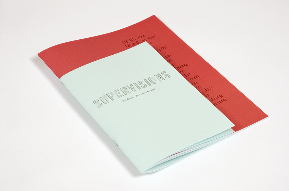
Korean Cultural Centre/British Council: Supervisions Show Catalogue.
A simple design i found, using a bold red against a light blue gives an interesting look. I would like to use a similar colour combination within some of my design for what is production for print.


Dodcument Set-up. InDesign CS5 / 5.5
- Choose File > New > Document.
The New Document dialog box combines the Document Setup and the Margins And Columns dialog boxes, so that you can set up the page size, margins, and page columns all in one place. You can change these settings at any time.
- Specify document setup options. (See New Document options.)
To specify the dimensions of the bleed and slug areas, click More Options. The bleed and slug areas extend out from the edges of the defined Page Size. To make the bleed or slug areas extend evenly on all sides, click the Make All Settings The Same icon .
.
- Click OK to open a new document with the settings you specified.
 To set default layout settings for all new documents,
choose File > Document Setup or Layout >
Margins And Columns, and set options when no documents are open.
To set default layout settings for all new documents,
choose File > Document Setup or Layout >
Margins And Columns, and set options when no documents are open.New Document options
- Document Preset
- Choose a preset that you have saver earlier.
- Intent
- If you are creating a document to be output to PDF or SWF for the web, choosing the Web option changes several options in the dialog box, such as turning off Facing Pages, changing the orientation from portrait to landscape, and using a page size based on monitor resolution. You can edit any of these settings, but you cannot change the Intent setting after the document is created.
- Number of pages
- Specify the number of pages to create in the new document.
- Start Page #
- Specify which number the document starts on. If you specify an even number (such as 2) with Facing Pages selected, the first spread in the document begins with a two-page spread. See Start a document with a two-page spread.
- Facing Pages
- Select this option to make left and right pages face each other in a double-page spread, such as for books and magazines. Deselect this option to let each page stand alone, such as when you’re printing flyers or posters or when you want objects to bleed in the binding. After you’ve created a document, you can use the Pages panel to create spreads with more than two pages or force the first two pages to open as a spread. (See Control spread pagination.)
- Master Text Frame
- Select this option to create a text frame the size of the area within the margin guides, matching the column settings you specified. The master text frame is added to the A‑Master. (See Using text frames on master pages.)The Master Text Frame option is available only when you’ve chosen File > New > Document.
- Page Size
- Choose a page size from the menu, or type values for Width and Height. Page size represents the final size you want after bleeds or other marks outside the page are trimmed.
- Orientation
- Click Portrait
 (tall)
or Landscape
(tall)
or Landscape  (wide).
These icons interact dynamically with the dimensions you enter in
Page Size. When Height is the larger value, the portrait icon is
selected. When Width is the larger value, the landscape icon is
selected. Clicking the deselected icon switches the Height and Width
values.To specify the dimensions of the bleed
and slug areas, click More Options in the New Document dialog box.
To make the bleed or slug areas extend evenly on all sides, click
the Make All Settings The Same icon .
(wide).
These icons interact dynamically with the dimensions you enter in
Page Size. When Height is the larger value, the portrait icon is
selected. When Width is the larger value, the landscape icon is
selected. Clicking the deselected icon switches the Height and Width
values.To specify the dimensions of the bleed
and slug areas, click More Options in the New Document dialog box.
To make the bleed or slug areas extend evenly on all sides, click
the Make All Settings The Same icon . - Bleed
- The Bleed area allows you to print objects that are arranged at the outer edge of the defined page size. For a page of the required dimensions, if an object is positioned at its edge, some white may appear at the edge of the printed area due to slight misalignment during printing or trimming. For this reason, you should position an object that is at the edge of the page of the required dimensions a little beyond the edge, and trim after printing. Bleed area is shown by a red line on the document. You can set bleed area settings from Bleed in the Print dialog box.
- Slug
- The slug area is discarded when the document is trimmed to
its final page size. The slug area holds printing information, customized
color bar information, or displays other instructions and descriptions
for other information in the document. Objects (including text frames)
positioned in the slug area are printed but will disappear when
the document is trimmed to its final page size. Objects outside
the bleed or slug area (whichever extends farther) do not print.
Note: You can also click Save Preset to save document settings for future use.
Document window overview
Each
page or spread in your document has its own pasteboard and guides,
which are visible in Normal View mode. (To switch to Normal View,
choose View > Screen Mode > Normal.) The
pasteboard is replaced with a gray background when the document
is viewed using one of the Preview modes. (See Preview documents.)
You can change the color of this preview background and guides in Guides
& Pasteboard preferences.
 Document window notes:
Document and guides in Normal View Mode
- A.
- Spread (black lines)
- B.
- Page (black lines)
- C.
- Margin guides (magenta lines)
- D.
- Column guides (violet lines)
- E.
- Bleed area (red lines)
- F.
- Slug area (blue lines)
- Lines of other colors are ruler guides which, when present, appear in the layer color when selected. See Layers.
- Column guides appear in front of margin guides. When a column guide is exactly in front of a margin guide, it hides the margin guide.
Create custom page sizes
You can create custom page sizes that appear in the Page
Size menu in the New Document dialog box.
- Choose File > New > Document.
- Choose Custom Page Size from the Page Size menu.
- Type a name for the page size, specify page size settings, and then click Add.
Define document presets
You can save document settings for page
size, columns, margins, and bleed and slug areas in a preset to
save time and ensure consistency when creating similar documents.
You can save a document preset to a separate
file and distribute it to other users. To save and load document
preset files, use the Save and Load buttons in the Document Presets
dialog box.
- Choose File > Document Presets > Define.
- Click New in the dialog box that appears.
- Specify a name for the preset and select basic layout options in the New Document Preset dialog box. (See New Document options for a description of each option.)
- Click OK twice.
You can save a document preset to a separate
file and distribute it to other users. To save and load document
preset files, use the Save and Load buttons in the Document Presets
dialog box.Create a document using a preset
- Do
one of the following:.
- Choose File > Document Preset > [name of preset]. (Hold down Shift while choosing the preset to create a new document based on the preset without opening the New Document dialog box.)
- Choose File > New > Document, and then choose a preset from the Document Preset menu in the New Document dialog box.
- Make changes to the options (if desired) and click OK.
Document Set-up. InDesign. CS4
ADOBE INDESIGN CS4
After you create a document, you may change your mind about
how you want it set up. For example, you may want single pages instead
of facing pages, or you may want to change the page size or margin
settings.
Change document setup
Changing
options in the Document Setup dialog box affects every page in the document.
If you change page size or orientation after objects have been added to
pages, you can use the Layout Adjustment feature to minimize the
amount of time needed for arranging existing objects. See About automatic layout adjustment.
- Choose File > Document Setup.
- Specify the document options, and then click OK. (See New Document options.)
Change page margin and column settings
You can change
column and margin settings for pages and spreads. When you change
the column and margin settings on a master page, you change the setting
for all pages to which the master is applied. Changing the columns
and margins of regular pages affects only those pages selected in
the Pages panel.
Note: The
Margins And Columns dialog box doesn’t alter columns inside
text frames. Text frame columns exist only within individual text
frames, not on the page itself. You can set up columns within individual
text frames by using the Text Frame Options dialog box. (See Change text
frame properties.) Text frame columns can also be affected
by the Layout Adjustment feature.
- Do one of the following:
- To change margin and column settings for one spread or page, go to the spread you want to change, or select one spread or page in the Pages panel.
- To change margin and column settings for multiple pages, select those pages in the Pages panel, or select a master that controls the pages you want to change.
- Choose Layout > Margins And Columns, specify
the following options, and then click OK.
- Margins
- Type values to specify the distance between margin guides and each edge of the page. If Facing Pages is selected in the New Document or Document Setup dialog box, the Left and Right margin option names change to Inside and Outside, so that you can specify additional inside margin space to accommodate binding.
- Columns
- Specify the number of columns.
Create unequal column widths
When you have more than one column
on a page, the column guides in the middle appear in pairs. When
you drag one column guide, the pair moves. The space between the
column guides is the gutter value you specified; the pair moves
together to maintain that value.
Note: You cannot create unequal column widths for columns in a text
frame. Instead, created threaded, side-by-side text frames with
different column widths.
- Go to the master or spread you want to change.
- If column guides are locked, choose View > Grids & Guides > Lock Column Guides to deselect it.
- Using the Selection tool
 , drag
a column guide. You can’t drag it past an adjacent column guide
or beyond the edge of the page.
, drag
a column guide. You can’t drag it past an adjacent column guide
or beyond the edge of the page.

Dragging a column guide to create unequal column widths
Document Set-up. Illustrator. CS5 / 5.5
As with CS4, CS5 / 5.5 allows you to change the default setup options for your
document, this includes units of measure, transparency grid display,
background colour and type settings such as language, quote style, super
script and subscript size and exportability.
- You can either select Document Set-up button in the control panel, or:
Choose File > Document Set-up.
- Choose options as you would like.
Again the 'Simulate Coloured
Paper' option is found on CS5 / 5.5, this allows the document to show the designer how certain
colours would look printed on coloured paper e.g. if yellow was printed
onto red paper it would look orange.
Document set-up. Illustrator. CS4
ADOBE ILLUSTRATOR CS4
Illustrator allows you to change the default setup options for your document, this includes units of measure, transparency grid display, background colour and type settings such as language, quote style, super script and subscript size and exportability.
You can close this dialog box by clicking 'Edit Artboards' this also activates the Artboard tool.
- You can either select Document Set-up button in the control panel, or:
Choose File > Document Set-up.
- Choose options as you would like
- If you want to do a simple change such as switching you art board from Portrait to Landscape, then select 'Edit Artboards' in Document Set-up.
The Document Set-up button is visible when nothing else is selected.
Another useful setting found on illustrator is the 'Simulate Coloured Paper' option, this allows the document to show the designer how certain colours would look printed on coloured paper e.g. if yellow was printed onto red paper it would look orange.
Monday, 7 November 2011
Bookbinding.
- Hardcover binding.
The Hardcover book features a hard external cover (called a “case” by the binding industry). These are usually covered with cloth, leather, or textured paper. On some books, the spine has a different covering material than the front and back panels. This is called quarter-binding and is very popular in the publishing industry.
Hardcover binding is a good choice for publishing, photobooks, yearbooks, dissertations, theses, high-end presentations, and proposals.
- Tape Binding
Tape binding uses a thermoplastic adhesive on a strip to bind books. In technique, it is similar to perfect binding, where the individual pages are glued to the book spine. Tape binding is a good choice for office documents, review books, or other presentations.
- Perfect Binding
Perfect binding is a punchless binding method that works by fastening the book block to the cover spine. It is often used for softcover books and is most familiar to people in the form of paperback books. It is also called adhesive binding, or unsewn binding.
- Sewn Binding
Sewn binding is usually used in conjunction with hard cover binding. The book block, or sections of the book block are sewn together prior to the addition of the cover. This makes for a very sturdy book. The biggest disadvantage to sewn binding is that it requires specialized, expensive equipment, and, when done on a custom basis, is a slow process.
- Wire Stitching
Wire stitching is a form of binding that uses wire staples to bind sheets together. Wire stitching can either be used as side stitching, or saddle stitching. Side stitching is used for thin books that are usually then either covered with a hard cover, or a tape strip. Saddle stitching binds the sheets together through the fold in the center of several pages. It is the form of binding commonly used on comic books and magazines.
- Plastic Comb Binding
Also called GBC binding, plastic comb binding is a punch-and-bind system that is used for many office documents. Its main advantage is that it is inexpensive and easily edited. Its disadvantage is its appearance and the security of the final book. Also, like other punch-and-bind systems, it requires more labor than tape binding.
- Wire-O Binding
Wire-O is a punch-and-bind system that is similar in technique to the plastic comb binding, but resembles wire spiral binding in appearance.
- Velobinding
Velobind is a punch-and-bind system that uses a two-part binding element. First the paper is punched with a series of tiny holes. One half of the binding element consists of a plastic strip with evenly spaced plastic spikes on one side. The other half of the binding element is a plastic strip with evenly spaced holes that match the punches. The spikes are pushed through one side of the paper and then fed through the plastic strip with holes. The ends of the spikes are melted off, creating the bind. A Velobound cannot be edited without rebinding.
- Spiral Binding
Spiral binding—as its name suggests—is a punch-and-bind system that uses a plastic or metal spiral wire that is wound through punched holes on the binding edge. It is the type of binding most often used for school notebooks and steno pads.
Folding.
| Single (half) Fold a single fold brochure made by folding the paper in half making four panels: (2-front + 2-back) |
 |
Tri-fold Brochure made by folding the paper in thirds. After folding it consists of six panels (3-front + 3-back) with the right panel tucked inside of the panels created by the first fold |
||
| Z Fold Brochures are made by folding the paper in thirds in “zig zags.” It opens like an accordion in the shape of a “Z” |
Single (half) Fold a single fold brochure made by folding the paper in half making four panels: (2-front + 2-back) |
|||
 |
Double Parallel Brochure made by folding a sheet of paper in half twice in the same direction making eight panels (2-front + 2-back). The last two panels need to be slightly smaller than the outer panels to fold properly inside the outer two panels |
 |
Accordion (”M”) Fold three zigzag folds with 8 panels (3 parallel folds that go in opposite directions). Each panel of the accordion fold are the same size |
|
 |
Single Gate Fold The left and right panels fold inwards to meet in the middle resulting in six panels: (3-fronts + 3-backs) |
|
Double Gate Fold The left and right panels fold inwards to meet in the middle and then folding at the center making eight panels: (4-fronts + 4-backs) Panels on each end need to be slightly smaller than the outer panels |
|
 |
Roll (Barrel) Fold the piece is folded inward multiple times as if you are “rolling up” the paper with folds. The outside two panels must be the largest, and each successive panel beginning with the 3rd must be about 1/16” smaller than the previous panel to fold properly. |
 |
Right Angle (French) Fold folding a page in half in one direction and then folding it in half again in the opposite direction. After folding it makes of eight panels: (4-fronts + 4-backs) |
|
 |
Half Fold & Tri Fold Folding a sheet of paper (often 17” x 11”) in half, and then tri-folded in the opposite direction |
Subscribe to:
Posts (Atom)